The reactions to be fair were pretty scathing. However quite frankly in my opinion, and granted it is just my opinion, very unfair.
The kit was one of the major announcements that the Louligans were looking forward to and it didn’t disappoint.
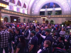
It was a grand affair, gentlemen in suits and ties, the who’s who in St Louis soccer was there many in their green hall of fame jackets. The lavish grand hallway at the Union Station hotel with the wonderful light show was worth going for alone. I have to confess I felt a little out of place.
We all have ideas and likes and dislikes when it comes to football shirts, we all eagerly await the latest $90 Nike or Adidas offerings of our favorite clubs. Will it be stripes? a Sash like the 1950’s team? How about a green and blue version of the bomb pop US cult classic? Will it be a simple V neck? or a polo collar? We needed to know!
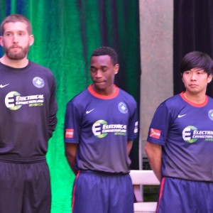
With much fanfare Ambersley, Gasecki, Pais, Renken and Taka were all paraded in the new kit. The initial reaction was “unexpected” there was little to no green that we all anticipated. The red collar was a massive surprise and I didn’t notice the fade to grey at first at all. (Then again, I don’t have the best vision) So it wasn’t until I saw pictures online that I noticed the fade down the front, the mustard colored numbers and the Mercy sponsorship on the back.
With the online outcry of disappointment, I’d like to stage a defense of this kit from someone who knows a bad kit when they see one. Whilst granted even before a ball has been kicked I am massively biased, the reaction this kit received was not deserved. So let’s discuss the shirt.
Blue front with fade to grey.
Great. no seriously, what’s not to like about it? We all knew the shirt would be predominantly blue and the fade adds a subtle pattern to keep it from being just a plain blue shirt. Why grey though? Well in 1996 England had a grey away shirt and Umbro who designed it said it was because grey is complimentary to blue denim. That was my argument. I’m not a soccer player, I’m not going to be a full kit wanker. I’ll wear this shirt with jeans or cargo shorts. I think the shirt will look great in that ensemble.
Red collar.
I really like the STL flag on the sleeve. This city has had a time of it the past twelve months. Be proud of St. Louis. It’s a fine city, Whether native or adopted, it’s our city. The red collar goes hand in hand to symbolize the flag. I think we all expected this accent to be green. But it is red. I am personally glad it isn’t a polo shirt granddad collar. It’s just a simple round neck and that’s the way god intended a football kit to be.
Mustard yellow numbers.
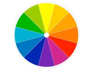
Odd choice at first eh? However, upon meticulous research of googling “color wheel” Mustard yellow is the polar opposite of blue. With all the games being broadcast on youtube, This will help the viewer (and match commentator) determine one player from another. Again it caught everyone by surprise, but it appears to be the natural choice if you want the player numbers to pop out and be distinctive.
Sponsors.
I have no illusions that the sponsors pay the bills. I think the Mercy on the back will look kind of odd on it’s own a quarter of the way down the back. It looks better when accompanied by the number. I really hope an outlet like soccer master or the club shop will be able customize the shirt to add numbers.
I know, You’re all thinking, Matt this is the biggest propaganda piece I’ve ever read, I am towing the party line. But seriously I am not. Having worn a Manchester United table cloth two years ago and a bellhop collar last year I am not shy in stating my opinion on what constitutes a bad kit. Just because this wasn’t what I was expecting doesn’t make it bad.
When John Brooks wheeled away in celebration having scored the winning goal against Ghana at last years world cup, the USA Bombpop shirt went from being much maligned to an instant cult classic. So as I said last night online, when Bryan Gaul towers over the Riverhounds centerback to score his hattrick goal in the home opener, This shirt will become the must have.
It’s blue, fade to grey soccer shirt with a red collar. It’s our shirt. Embrace the goodness of it.


Leave a Reply